





Interface Design: Enhancing User Experience and Interaction
Chapter 1: Introduction
Welcome to the world of Interface Design, where we will embark on a journey exploring the art and philosophy behind interface design, delve into well-known design patterns, and discuss the intricacies of design language.
To truly appreciate the art of interface design, we must recognize its profound impact on human experiences. Interfaces are not just mere tools or gateways; they shape our interactions with technology and the world around us. They possess the power to bridge the gap between humans and machines, to enable seamless communication, and to enhance our lives in unimaginable ways.
When we examine design patterns, we uncover the tried and tested techniques that have stood the test of time. These patterns are the building blocks of effective interface design, providing us with a common language and framework to create intuitive and user-friendly experiences. They offer us guidance, allowing us to learn from the successes and failures of those who came before us. By understanding and mastering these patterns, we can design interfaces that resonate with users on a deep level, fostering familiarity and enabling effortless interaction.
Yet, let us not confine ourselves to the mere practicality of design patterns. Interface design is not solely about functionality; it is an art form in its own right. It carries within it a philosophical dimension that extends beyond the surface. It seeks to answer profound questions about human cognition, perception, and emotion. It challenges us to consider the very nature of reality, the boundaries of our senses, and the ways in which we relate to information.
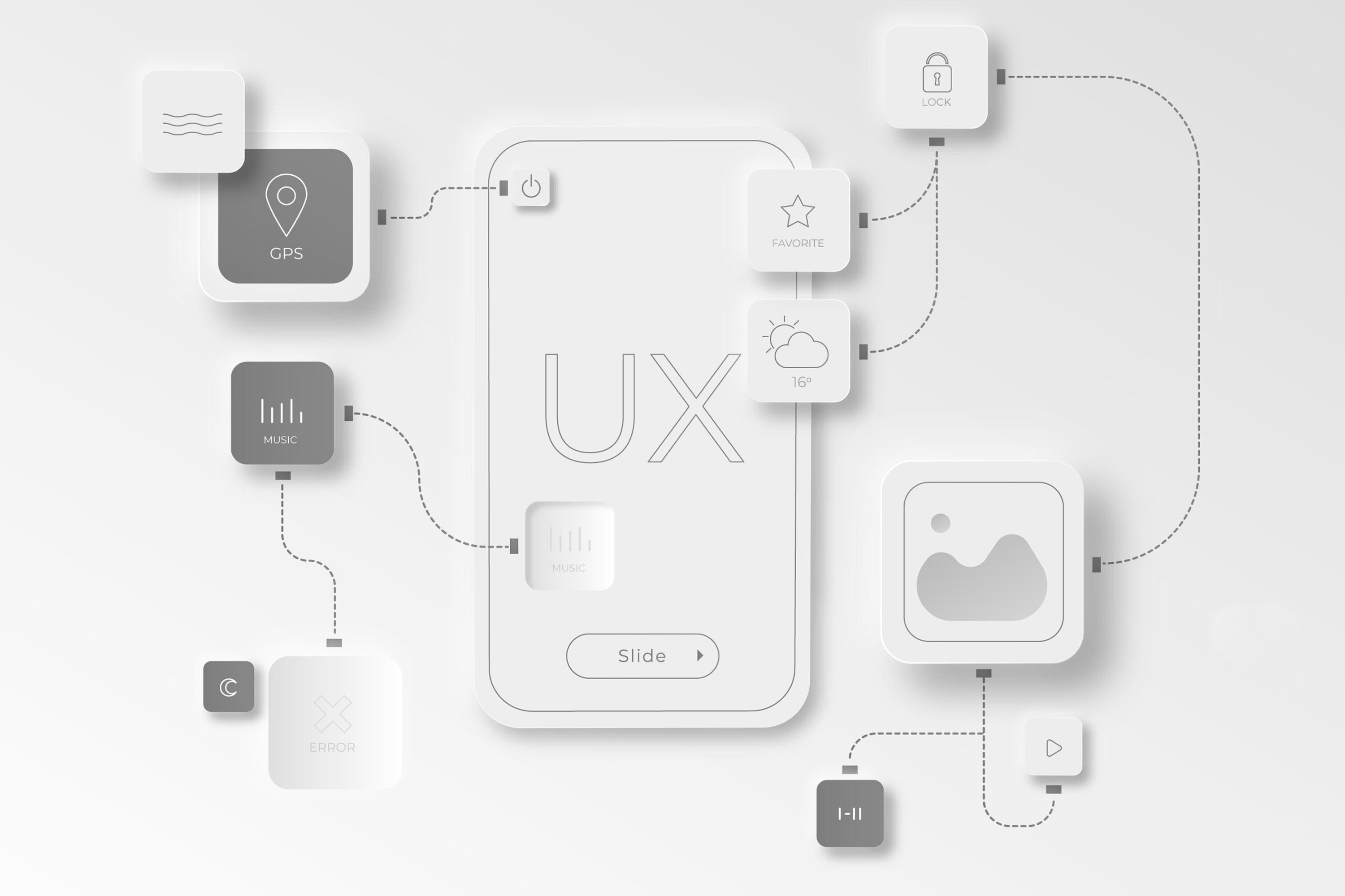
In this context, design language emerges as a means of expression—a unique vocabulary that designers utilize to communicate with their audience. It encompasses not only visual elements but also the underlying principles that guide our decision-making processes. A well-defined design language ensures consistency, coherence, and clarity in our interfaces, allowing users to navigate effortlessly and intuitively. It reflects our understanding of human psychology, cultural context, and the art of storytelling.
Chapter 2: Understanding Interface Design
Within the field of design, there are secret treasures waiting to be discovered—hidden gems that elevate the craft to new heights. As we explore these secrets, we unlock innovative approaches, unconventional perspectives, and fresh insights. Embracing curiosity and embracing the unknown, we open ourselves to new possibilities and breakthroughs in our designs. Remember, true innovation often lies at the intersection of tradition and audacity.
Now, let us journey into the realm of digital interface design, where software becomes the canvas for our creativity. Here, the lines between the physical and the virtual blur, and human-software interaction takes center stage. We must consider not only the functional requirements but also the emotional and psychological needs of our users. Empathy and human-centered design are the keys to creating interfaces that touch people's lives, that resonate with their desires, and that spark joy in their daily interactions.
Key Elements of Interface Design
As we navigate the ever-evolving landscape of interface design, we must keep an eye on the future. Technology is advancing at an unprecedented pace, with emerging trends such as augmented reality, virtual reality, voice interfaces, and artificial intelligence reshaping our digital experiences. We must embrace these new possibilities, pushing the boundaries of our imagination and envisioning the interfaces of tomorrow. Let us strive for a future where technology seamlessly integrates into our lives, enhancing our humanity rather than replacing it.
One aspect that deserves our attention is the role of storytelling in interface design. Interfaces have the power to tell stories, to evoke emotions, and to create meaningful connections. By weaving narratives into our designs, we can engage users on a deeper level, capturing their attention and leaving a lasting impression. Let us explore the art of storytelling and how it can be seamlessly integrated into the fabric of interface design.
The idea of Layouts
In the realm of interface design, layouts hold a profound significance that goes beyond their practical purpose. They serve as the foundation upon which our digital experiences are constructed, providing structure, organization, and a sense of harmony. In a deep philosophical context, layouts can be seen as a reflection of the fundamental order that underlies the universe itself.
Just as the universe is composed of intricate patterns, relationships, and interconnectedness, so too are layouts. They embody the principles of balance, symmetry, and proportion, resonating with our innate sense of aesthetic harmony. In this sense, layouts become a means to tap into the underlying rhythms of existence, capturing the essence of beauty and order.
At a deeper level, layouts invite contemplation on the nature of perception and cognition. They shape how we interpret and interact with information, influencing our thought processes and emotional responses. Through deliberate arrangement of elements, layouts guide our attention, create focal points, and establish hierarchies of importance. They challenge us to explore the dynamics between order and chaos, between simplicity and complexity, and between the known and the unknown.
Layouts also have the power to evoke emotions and convey narratives. Just as a symphony unfolds with carefully composed movements, layouts orchestrate visual compositions that elicit specific feelings and tell stories. They invite us to embark on a journey, guiding us through a sequence of moments and experiences. In this sense, layouts become a form of visual storytelling, engaging our imagination and invoking a sense of wonder.
In contemplating layouts from a deep philosophical perspective, we recognize their role as mediators between the tangible and the intangible, the visible and the invisible. They possess the ability to transcend the boundaries of the screen, extending into the realms of meaning, purpose, and the human condition. Ultimately, layouts offer us a glimpse into the profound interplay between form and content, design and philosophy, and the intricate tapestry that weaves together our digital experiences.
Typography

Typography, in its essence, transcends the mere arrangement of letters and words. It embodies a profound philosophical dimension, encapsulating the power of language, the rhythm of communication, and the essence of human expression. Through typography, we enter a realm where the visual and the semantic converge, where the spoken and the written intertwine, and where meaning finds its visual form.
At its core, typography reflects our relationship with language and knowledge. It invites us to ponder the intricacies of symbols and their ability to convey meaning. Each letter carries a history, a cultural significance, and a unique identity. The choice of typefaces, the spacing between characters, and the arrangement of text all become vehicles through which we engage with the complexities of communication. Typography reveals the artistry in the written word and the poetry in the visual arrangement.
Typography also prompts us to consider the nature of interpretation and perception. As we encounter different typefaces, we instinctively form impressions and associations. Shapes, strokes, and proportions evoke emotions, convey personality, and shape our understanding of content. Typography, in its nuanced variations, invites us to question the subjective nature of perception and the interplay between form and meaning. It challenges us to delve deeper into the mysteries of semiotics and the ways in which we make sense of the world.
Moreover, typography carries within it a sense of timelessness and cultural heritage. It connects us to the rich traditions and histories of written language. From ancient calligraphy to modern typefaces, each style carries the echoes of generations, telling stories of the past and bridging the gap between different cultures and eras. Typography becomes a gateway to explore the interconnectedness of humanity and the universal power of communication.
In contemplating typography from a deep philosophical perspective, we recognize its ability to transcend the utilitarian and become an art form in its own right. It invites us to question the very nature of language, perception, and expression. Through the interplay of form and meaning, typography unveils the intricate dance between the tangible and the abstract, the visible and the invisible. It reminds us of the beauty and complexity of communication and encourages us to delve into the depths of typography's philosophical essence.
The Color Palette

Colors, beyond their visual appeal, hold a profound philosophical significance that reaches deep into our human experience. They embody the essence of perception, emotion, and the interplay between light and darkness. In a deep philosophical context, colors become a language of the soul, conveying meaning and evoking profound sensations that transcend the boundaries of words.
Colors are imbued with symbolism and cultural associations, offering a gateway to explore the complexities of human perception and interpretation. Each hue carries its own unique character, carrying the weight of history, tradition, and personal experiences. From the vibrant reds that evoke passion and vitality to the serene blues that inspire tranquility and depth, colors reflect the nuances of our emotions and the depths of our collective consciousness.
Moreover, colors illuminate the interplay between light and darkness, inviting us to contemplate the inherent duality of existence. In the absence of light, colors cease to be, emphasizing their essential connection to illumination and vitality. The contrast between light and darkness becomes a metaphor for the interdependent forces that shape our lives—the yin and yang, the joys and sorrows, and the perpetual dance between opposing elements.
In the realm of design, colors become tools for communication and expression, enabling us to create visual narratives and evoke specific responses. They have the power to transcend the physical realm and touch the depths of our being. By understanding the philosophical underpinnings of colors, we can harness their potential to create meaningful and resonant experiences, tapping into the universal language that colors speak to our souls.
In conclusion, colors in a deep philosophical context reveal themselves as conduits of perception, emotion, and symbolism. They guide our experiences, evoke our emotions, and reflect the intricate tapestry of our human existence. By exploring the philosophical dimensions of colors, we unlock the potential to create harmonious, evocative, and resonant designs that touch the depths of our collective consciousness.
Icons & Graphics
Icons and graphics, in their essence, transcend their visual representation and possess a deep philosophical significance. They encapsulate the power of symbolism, the essence of abstraction, and the human impulse to distill complex ideas into simple forms. In a deep philosophical context, icons and graphics become vessels through which we explore the fundamental nature of meaning, representation, and the interplay between the concrete and the abstract.
Icons and graphics serve as visual shorthand, compressing layers of meaning into concise and recognizable symbols. They tap into the universal language of imagery, transcending linguistic barriers and offering a bridge between diverse cultures and perspectives. In this sense, icons and graphics become tools for communication, enabling us to convey complex concepts, emotions, and narratives with a single, powerful image.
Furthermore, icons and graphics invite contemplation on the nature of perception and interpretation. As viewers encounter these visual representations, they are prompted to engage their own cognitive processes, drawing upon their experiences, cultural backgrounds, and personal associations to decipher their meanings. The act of interpreting icons and graphics becomes a reflection of the human capacity to find meaning and construct understanding from the abstract and the ambiguous.
In a deeper sense, icons and graphics become a manifestation of our innate desire to simplify and distill complex realities. They represent our quest for clarity, for reducing the chaotic and overwhelming aspects of the world into manageable and comprehensible forms. By exploring the philosophical dimensions of icons and graphics, we gain insight into the human propensity to seek simplicity, to extract meaning from the multitude, and to embrace the power of visual language in shaping our perception and understanding of the world.
In conclusion, icons and graphics hold a profound philosophical dimension that transcends their visual nature. They are vessels of symbolism, bridges of communication, and reflections of our human impulse to seek meaning and simplicity. By delving into the philosophical aspects of icons and graphics, we deepen our understanding of their power to convey complex ideas, evoke emotions, and shape our perception of the world.
The world of Interaction Patterns
Interaction patterns, in their essence, transcend the realm of practicality and hold a deep philosophical significance. They embody the interplay between human agency and the digital world, inviting us to explore the nature of communication, interconnectedness, and the dynamics of relationships. In a deep philosophical context, interaction patterns become a lens through which we examine the fundamental aspects of human existence, our place in the world, and our interactions with technology.
At the heart of interaction patterns lies the concept of reciprocity. They reflect the intricate dance between action and response, the give and take that underlies our interactions. By observing and understanding these patterns, we gain insights into the profound interdependence between individuals, systems, and the world at large. We recognize the interconnectedness of our actions and the impact they have on the digital ecosystems we inhabit.
Interaction patterns also invite contemplation on the nature of intention and purpose. They are imbued with meaning and intentionality, designed to guide and facilitate our engagement with digital interfaces. As we navigate these patterns, we are prompted to reflect on the purpose behind our interactions, the choices we make, and the consequences they entail. By understanding the philosophical underpinnings of interaction patterns, we deepen our awareness of our role as agents of change and co-creators of the digital landscape.
Moreover, interaction patterns prompt us to question the boundaries of our individuality and the merging of identities in the digital realm. They challenge traditional notions of self and other, as we engage in collaborative, immersive, and networked interactions. In this context, interaction patterns become a catalyst for philosophical inquiry into the nature of identity, the ethics of online presence, and the meaning of authenticity in a world where our digital interactions shape our perceptions and relationships.
In conclusion, interaction patterns offer a philosophical lens through which we explore the complexities of human existence, our relationship with technology, and the dynamics of our digital interactions. They illuminate the reciprocity, intentionality, and interconnectedness that lie at the heart of our digital experiences. By embracing the philosophical dimensions of interaction patterns, we deepen our understanding of ourselves, our place in the world, and the profound impact our interactions have on shaping the future of human-software relationships.
Chapter 3: Principles of Effective Interface Design
Simplicity and Minimalism
Simplicity is a fundamental principle in interface design. A simple and minimalist interface reduces cognitive load and helps users focus on their tasks. By eliminating unnecessary elements, clutter, and visual noise, designers can create interfaces that are visually appealing and easy to understand.
Consistency
Consistency is key to providing a coherent user experience. Interface elements, such as buttons, icons, and navigation, should maintain a consistent design and behavior throughout the product. Consistency enhances usability, reduces confusion, and allows users to build mental models, enabling them to predict how the interface will behave.
Visibility and Feedback
An effective interface provides clear visibility of relevant information and actions. Users should be able to easily perceive what options are available and how to interact with them. Additionally, providing feedback to users when they perform actions or encounter errors is crucial for maintaining engagement and guiding their progress.
User Control
Users should have a sense of control over their interactions with the interface. Designers should empower users to customize settings, undo actions, and navigate freely. By offering flexibility and autonomy, interfaces become more user-centric and adaptable to individual preferences.
Fitts's Law and Ergonomics
Fitts's Law states that the time it takes to reach a target is determined by the size and distance of the target. Designers should consider the ergonomic aspects of interface elements, such as button sizes and spacing, to ensure ease of use and minimize errors.
Accessibility
Interface design should be inclusive and accessible to users with disabilities. Considerations such as color contrast, keyboard navigation, alternative text for images, and screen reader compatibility are essential for providing equal access to all users. By adhering to accessibility guidelines, designers ensure that individuals with visual impairments, hearing impairments, motor disabilities, or cognitive limitations can navigate and interact with the interface effectively.
Designing with accessibility in mind not only benefits users with disabilities but also improves the overall usability and user experience for all users. For example, providing clear and descriptive alternative text for images not only helps visually impaired users understand the content but also assists search engines in indexing and ranking the interface's content.
Responsive Design
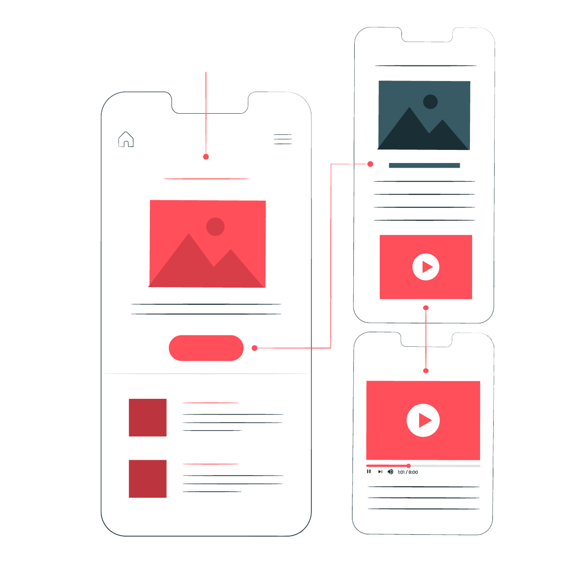
In today's digital landscape, interfaces need to adapt to various devices and screen sizes. Responsive design ensures that the interface responds and adjusts to different screen resolutions, providing a consistent user experience across devices such as desktops, laptops, tablets, and smartphones.
Responsive design involves fluid grid layouts, flexible images, and media queries that allow the interface to reflow and resize based on the available screen space. This approach eliminates the need for separate designs for each device and improves accessibility, as users can access the interface on their preferred device without sacrificing usability or content.
Chapter 4: Getting to know the secrets
Consistency
The Law of Consistency states that maintaining consistency throughout an interface enhances usability and user experience. Consistency involves using consistent visual elements, interaction patterns, and terminology across different parts of the interface or related interfaces. By adhering to consistent design principles, users can easily understand and predict how different elements and interactions will behave, reducing cognitive load and increasing efficiency.
Von Restorff Effect
The Von Restorff Effect, also known as the "Isolation Effect," states that an item that stands out or is distinctive from its surroundings is more likely to be remembered. In design, this effect highlights the importance of creating visual contrast and emphasizing important elements to make them more memorable to users. By leveraging this effect, designers can draw attention to critical information or actions, improving user recall and overall user experience.
Memory Load - Cognitive
The Law of Cognitive Memory Load states that interfaces should minimize the cognitive effort required from users to complete tasks. Users have limited working memory, so reducing cognitive load is essential for optimal usability. Designers can achieve this by simplifying complex processes, providing clear instructions, offering contextual cues, and reducing the number of steps or interactions required to complete tasks. By optimizing cognitive memory load, designers can improve user efficiency and prevent information overload.
Miller's Law
Miller's Law, also known as the "Magical Number Seven, Plus or Minus Two," suggests that the average human working memory can hold approximately seven (plus or minus two) chunks of information at a time. This principle is crucial in design, as it highlights the importance of presenting information in a concise and manageable way. Designers can use Miller's Law to optimize information organization, chunking information into smaller groups, and reducing cognitive overload for users.
Accessibility
The Law of Accessibility emphasizes the need to design interfaces that are inclusive and accessible to users with disabilities or impairments. Designing for accessibility involves adhering to accessibility guidelines, such as providing alternative text for images, using proper color contrast, ensuring keyboard navigation support, and implementing screen reader compatibility. By considering accessibility from the early stages of design, designers can ensure that their interfaces are usable by a wider range of users, promoting inclusivity and equal access.
The Golden Ratio
The golden ratio, often represented by the Greek letter phi (Φ), is a mathematical concept that exhibits a unique and aesthetically pleasing proportion. It is approximately equal to 1.6180339887 and is derived by dividing a line into two parts such that the ratio of the whole line to the longer segment is equal to the ratio of the longer segment to the shorter segment. This ratio has been revered throughout history for its harmonious and balanced qualities, making it a recurring feature in art, architecture, and nature, captivating the human eye with its inherent beauty.
Flexibility
The Law of Flexibility emphasizes the importance of providing users with customizable options and adaptable interfaces. Users have diverse needs and preferences, and offering flexibility in how they interact with and personalize the interface can enhance user satisfaction. Designers should strive to provide adjustable settings, customizable layouts, and personalized features to accommodate various user requirements and workflows.
Visual Hierarchy
The Law of Visual Hierarchy emphasizes the importance of organizing information and visual elements in a hierarchical manner to guide users' attention and comprehension. By using visual cues such as size, color, contrast, and positioning, designers can create a clear visual hierarchy that directs users to the most important information or actions. A well-structured visual hierarchy ensures that users can quickly scan and navigate the interface, leading to improved usability and information retention.
Serial Position Effect
The Serial Position Effect describes the tendency of people to remember the first and last items in a series better than those in the middle. In design, understanding this effect can help designers prioritize and emphasize critical information or actions at the beginning and end of a user flow or interface. By strategically placing important content or actions, designers can improve information retention and user engagement.
Postel's Law
Postel's Law, also known as the "Robustness Principle," states that systems should be liberal in what they accept and conservative in what they send. This principle is often applied to network protocols and data communication, suggesting that systems should be lenient when receiving data but strict when sending data. By following this principle, designers can create more flexible and tolerant systems that can handle a wide range of inputs and accommodate user variations.
Tesler's Law
Tesler's Law, also known as the "Law of Conservation of Complexity," states that every application or system has inherent complexity, and it cannot be completely eliminated. Instead, the complexity must be distributed between users and the system itself. This principle suggests that designers should strive to simplify the user's interaction with the system by taking on the complexity themselves, reducing cognitive load and making the interface more user-friendly.
Clarity
The Law of Clarity suggests that interfaces should prioritize clear and unambiguous communication. Designers should use concise and straightforward language, avoid jargon or technical terms, and provide visual clarity through the use of appropriate typography, icons, and visual cues. Clarity ensures that users can easily understand the purpose and meaning of interface elements, reducing confusion and errors while promoting a positive user experience.
Zeigarnik Effect
The Zeigarnik Effect suggests that people remember unfinished or interrupted tasks better than completed ones. This effect implies that users are more likely to recall and return to tasks or interactions that were left incomplete. Designers can utilize this effect by providing visual cues, reminders, or progress indicators to encourage users to complete tasks or return to unfinished interactions, enhancing user engagement and task completion rates.
Familiarity
The Law of Familiarity suggests that leveraging familiar design patterns and conventions enhances user understanding and usability. Users are more likely to engage with interfaces that resemble what they are already familiar with, such as commonly used icons, navigation structures, or interaction gestures. By incorporating familiar elements into the design, designers can reduce the learning curve, facilitate quicker user interactions, and provide a sense of comfort and confidence to users.
Law of Prägnanz
The Law of Prägnanz, also known as the "Law of Good Figure" or "Law of Simplicity," asserts that people perceive and interpret ambiguous or complex visual stimuli in the simplest and most organized way possible. It means that individuals tend to simplify and group visual elements into meaningful patterns or shapes. Designers often leverage this law by creating clear and simple visual designs, minimizing unnecessary complexity, and facilitating easy comprehension for users.
Parkinson's Law
Parkinson's Law states that work expands to fill the time available for its completion. This principle implies that when given more time to complete a task, individuals tend to procrastinate and take longer to finish the task. In design, understanding Parkinson's Law can help in setting realistic deadlines and establishing efficient workflows to prevent unnecessary delays and keep projects on track.
Hick's Law
Hick's Law, also known as the "Law of Choice Reaction Time," states that the time it takes for a person to make a decision increases logarithmically with the number of choices available. It suggests that increasing the number of choices can lead to decision-making difficulties, longer response times, and potential user frustration. Designers often leverage this principle by reducing the number of options or presenting choices in a more organized and manageable way to streamline user decision-making processes.
Law of Common Region
The Law of Common Region suggests that objects that are grouped together within a common boundary or region are perceived as related or belonging to the same category. This principle is often employed in interface design by visually grouping related elements or content using borders, colors, or other visual cues. By applying this law, designers can enhance the user's ability to recognize relationships between elements and improve the overall organization and clarity of the interface.
Fitts's Law

Fitts's Law is a predictive model that relates the time required to move to a target to the size and distance of the target. It states that the time required to reach a target is proportional to the target's distance and inversely proportional to its size. In practical terms, this law is often applied in interface design, emphasizing the importance of large and easily accessible targets to enhance user interaction and minimize errors.
Goal-Gradient Effect
The goal-gradient effect suggests that individuals become more motivated and experience a greater sense of progress as they approach a goal. This effect is based on the observation that people tend to exert more effort and engage in increased goal-directed behavior as they get closer to completing a task or achieving an objective. By understanding this effect, designers can structure user experiences to take advantage of the motivational boost that occurs as individuals perceive themselves moving closer to their goals.
Law of Proximity
The Law of Proximity states that objects or elements that are close to each other are perceived as related or forming a group. This principle is frequently used in interface design to visually group related content or elements, making it easier for users to understand relationships and navigate the interface. By leveraging the Law of Proximity, designers can create clear visual hierarchies and improve the overall organization and scannability of the interface.
Law of Uniform Connectedness
The Law of Uniform Connectedness states that elements that are visually connected to each other are perceived as a single unit or group. This principle is often utilized in interface design by visually connecting related elements using lines, containers, or other connecting elements. By applying this law, designers can improve the user's ability to recognize relationships and interactions between elements, enhancing the overall organization and comprehension of the interface.
Law of Similarity
The Law of Similarity suggests that elements that share similar visual properties, such as shape, size, color, or texture, are perceived as belonging to the same group or category. By applying this principle in design, designers can use visual cues to indicate relationships or groupings, making it easier for users to understand and navigate the interface. Consistent use of visual similarity can enhance the user's ability to process information and improve overall user experience.
Jakob's Law
Jakob's Law states that users are accustomed to interacting with interfaces that follow common design patterns and conventions. The law emphasizes the importance of consistency in user interface design, suggesting that users' familiarity with existing designs will influence their expectations and preferences. Designers can leverage Jakob's Law by adhering to established interface conventions, making it easier for users to navigate and understand new systems or applications.
Peak-End Rule
The Peak-End Rule suggests that people's memory of an experience is heavily influenced by the peak (most intense or memorable moment) and the end of that experience. According to this principle, positive peaks and a positive ending can significantly impact how users perceive and remember an overall experience. Designers can leverage the Peak-End Rule by creating positive and memorable moments during user interactions and ensuring a positive final impression to enhance user satisfaction and memory of the experience.
Pareto Principle
The Pareto Principle, also known as the "80/20 Rule," states that roughly 80% of the effects come from 20% of the causes. In design, the Pareto Principle suggests that a significant portion of the desired outcomes or user issues can be addressed by focusing on a small set of essential features or improvements. By identifying and prioritizing the vital few aspects, designers can allocate resources more effectively and achieve the most significant impact on user experience.
Occam's Razor
Occam's Razor is a problem-solving and decision-making principle that states that among competing hypotheses, the one with the fewest assumptions should be selected. In design, Occam's Razor guides designers to choose the simplest and most straightforward solution to a problem, avoiding unnecessary complexity. By adhering to this principle, designers can create streamlined and intuitive experiences that are easier for users to understand and navigate.
Doherty Threshold
The Doherty Threshold, also known as the "Law of Diminishing Returns," states that as the speed of a system increases, the user's sense of satisfaction and efficiency plateaus. Beyond a certain point, further improvements in speed do not significantly enhance the user experience. This principle helps in determining the optimal speed or response time for a system, striking a balance between performance and user satisfaction.
Aesthetic-Usability Effect
The aesthetic-usability effect suggests that users perceive aesthetically pleasing designs as more usable and effective. When a product or interface is visually appealing, users tend to perceive it as more intuitive, easier to use, and more trustworthy. This effect highlights the importance of considering aesthetics as a crucial aspect of usability, as it can greatly influence user experience and satisfaction.
Chapter 5: User-Centered Design Approach
User Research and Analysis
User-centered design places the needs and preferences of the users at the forefront of the design process. Conducting user research, such as interviews, surveys, and usability tests, helps designers gain insights into user behaviors, goals, and pain points. By understanding the target audience, designers can create interfaces that align with user expectations and provide meaningful solutions.
Wireframing and Prototyping
Wireframing and prototyping are essential steps in interface design. Wireframes are low-fidelity, simplified representations of the interface's structure and layout. They focus on the arrangement of elements and the flow of information. Prototypes, on the other hand, provide an interactive representation of the interface, allowing users to experience and provide feedback on its functionality and usability.
By creating wireframes and prototypes, designers can iterate and refine the interface design based on user feedback, ensuring that it meets user needs and expectations before proceeding to the development stage.
Usability Testing
Usability testing involves observing and collecting feedback from users as they interact with the interface. This process helps identify usability issues, pain points, and areas for improvement. Through usability testing, designers can validate design decisions, uncover usability barriers, and make data-driven refinements to enhance the overall user experience.
Usability testing can be conducted through moderated or unmoderated sessions, depending on the resources and objectives of the design project. By involving real users in the testing process, designers gain valuable insights that can inform design decisions and optimize the interface.
Iterative Design Process
The iterative design process involves continuously refining and improving the interface through multiple iterations. Designers collect user feedback, conduct usability testing, and make iterative changes to the interface based on the insights gained. This cyclical process allows designers to address usability issues, refine interactions, and enhance the overall user experience.
By embracing an iterative design process, designers can create interfaces that are user-centric, efficient, and aligned with user expectations. It also allows for flexibility and adaptability, enabling the interface to evolve as user needs and technologies change over time.
Chapter 6: Navigation and Information Architecture
Clear and Intuitive Navigation
Navigation is a critical aspect of interface design, as it determines how users move through and access different parts of the interface. A clear and intuitive navigation system enhances usability and allows users to find what they're looking for efficiently.
The navigation menu should be easily visible and accessible, preferably located in a consistent position across screens or pages. It should use clear and concise labels that accurately represent the content or sections they link to. Employing familiar navigation patterns, such as horizontal or vertical menus, dropdown menus, or hamburger menus on mobile devices, helps users quickly understand how to navigate the interface.
Breadcrumbs, which display the user's current location within a hierarchical structure, provide context and aid in navigation. They allow users to easily backtrack or access higher-level categories without getting lost.
Hierarchical and Flat Structures

The information architecture of an interface determines how content and functionality are organized and structured. Two common approaches are hierarchical and flat structures.
Hierarchical structures involve categorizing information into levels, such as main categories, subcategories, and sub-subcategories. This approach works well for complex interfaces with a large amount of content. It allows users to navigate through a structured hierarchy and drill down to specific details.
Flat structures, on the other hand, present information in a more horizontally oriented manner, without deep levels of nesting. This approach works well for simpler interfaces or when content doesn't lend itself to clear hierarchies. It allows users to access content more quickly and reduces the cognitive load associated with navigating through multiple levels.
The choice between hierarchical and flat structures depends on the nature of the content, the user's goals, and the overall complexity of the interface. Designers should consider the trade-offs between depth of hierarchy and ease of navigation when deciding on the information architecture.
Search Functionality
In interfaces with a vast amount of content or complex navigation, incorporating a search function can greatly improve the user experience. A search bar allows users to quickly find specific information or features by entering keywords or phrases.
To ensure the effectiveness of the search functionality, it should be prominently placed and easily accessible. Auto-suggestions and filtering options can help users refine their search queries and find relevant results more efficiently. Providing informative search result pages with clear titles, descriptions, and relevant snippets enables users to evaluate the relevance of the search results before clicking through.
Consistent and Contextual Navigation
Consistency in navigation across the interface enhances learnability and reduces cognitive load. Users should be able to rely on consistent placement, labeling, and behavior of navigation elements throughout the interface. This allows them to develop mental models and confidently navigate between different sections.
Contextual navigation refers to the dynamic display of navigation options based on the user's current context or task. This can include contextual menus, breadcrumbs, or inline navigation links that provide relevant options based on the user's location or actions within the interface. Contextual navigation improves efficiency by reducing the need to backtrack or navigate through multiple screens.
Strategically combining consistent and contextual navigation elements ensures a seamless and intuitive user experience, enabling users to effortlessly move through the interface and accomplish their goals.
Chapter 7: Emerging Trends in Interface Design
Voice User Interfaces (VUI)
Voice user interfaces utilize voice recognition technology to enable users to interact with interfaces through spoken commands. With the rise of virtual assistants like Siri, Alexa, and Google Assistant, VUI has gained popularity and is being integrated into various applications and devices. Designing for VUI requires considering speech patterns, natural language understanding, and providing clear voice prompts and feedback.
Augmented Reality (AR) and Virtual Reality (VR)

AR and VR technologies provide immersive experiences by overlaying digital content onto the real world (AR) or creating entirely virtual environments (VR). These technologies offer exciting opportunities for interface design, allowing users to interact with interfaces in three-dimensional spaces. Designing for AR and VR involves considerations such as spatial awareness, intuitive gestures, and creating visually compelling and interactive interfaces.
Microinteractions and Delightful Details
Microinteractions are subtle and contained moments of interaction within an interface. These interactions provide feedback, guide users, and add an element of delight to the user experience. From subtle hover effects to animated button transitions, incorporating well-designed microinteractions can create a more engaging and memorable user experience.
Dark Mode
Dark mode has gained popularity as an alternative color scheme that uses dark backgrounds and light-colored text and elements. It reduces eye strain, conserves battery life on OLED displays, and provides a visually appealing alternative. Designing for dark mode requires careful consideration of color contrast, legibility, and ensuring that all interface elements are visible and accessible in both light and dark modes.
Chapter 8: Conclusion
Effective interface design is a multidisciplinary process that combines aesthetics, usability, and user-centered principles. By understanding the principles, best practices, and emerging trends in interface design, designers can create intuitive, visually appealing, and engaging interfaces that enhance user experience and interaction with digital products. From color theory and typography to navigation and emerging technologies, each aspect of interface design plays a crucial role in shaping the user's perception, usability, and enjoyment of digital interfaces.

Another area of interest is the psychology of interfaces. Human beings are complex creatures with varied cognitive processes, behaviors, and preferences. By understanding the psychology behind user behavior, we can design interfaces that cater to their needs and desires. From color psychology to information architecture, from visual hierarchy to gamification, the knowledge of human psychology provides us with invaluable insights to create impactful and user-centric interfaces.
Let us not forget the importance of accessibility in interface design. Inclusivity is a fundamental principle that should guide our design decisions. Interfaces should be designed with the understanding that users may have diverse abilities and limitations. By adopting inclusive design practices, we ensure that everyone, regardless of their physical or cognitive abilities, can access and interact with our interfaces. Let us explore the challenges and opportunities of designing interfaces that are accessible to all.
Finally, in this rapidly changing technological landscape, ethical considerations become paramount. As designers, we have the responsibility to be mindful of the impact our interfaces have on society, privacy, and well-being. Let us discuss the ethical dimensions of interface design, including data privacy, algorithmic biases, and the implications of persuasive design. By adhering to ethical guidelines and principles, we can create interfaces that respect users' autonomy, foster trust, and promote positive social change.
In conclusion, the art of interface design encompasses a multitude of dimensions: philosophy, design patterns, design language, digital interfaces, human-software interaction, and the exploration of future possibilities. Today, let us embrace these topics with a sense of wonder, curiosity, and a deep commitment to creating interfaces that inspire, engage, and empower. Together, we can shape a future where interfaces seamlessly blend into the fabric of our lives, enhancing our experiences and forging meaningful connections between humans and technology. Thank you for joining us on this exciting journey.
